
BOOK COVER DESIGN — CASE STUDY
55 Questions on Health & Fitness
Amit Baraskar · Self-help / Wellness · Print & Digital
CLIENT
Amit Baraskar
AUTHOR
CA, Sports Nutritionist (IFA)
DELIVERABLE
Book cover design
EXPLORATIONS
3 concepts
THE BRIEF
ABOUT THE BOOK
Science-backed Q&A guide structured around four pillars of well-being: Diet, Physical Activity, Recovery, and Monitoring. Written by a former state-level athlete turned CA and certified Sports Nutritionist, blending disciplined research with practical application.
DESIGN DIRECTION NEEDED
- Communicate all four pillars visually
- Feel credible, not trendy or gym-poster
- Work for dual audiences: Indian and international
- Clean, structured, information-forward tone
AUTHOR POSITIONING
Not a fitness influencer but a rigorous practitioner: former high-jump record holder, CA, treasury specialist. The cover needed authorityand precision, not inspiration-poster energy.
ICONOGRAPHIC APPROACH
Each pillar mapped to one flat icon: food bowl
(diet), pull-up bar figure (activity), meditation
figure (recovery), health monitor
(measurement).

SELECTED DIRECTION
The Annotated Diagram
A central icon panel sits inside a clean grey field, with the four pillar labels written in casual hand-script and connected to each quadrant via fine leader lines, like a researcher’s annotated diagram. The title anchors the lower third in a confident display type pairing: spaced small-caps author name above a large numeral “55” setalongside serif title text. Muted blue-grey palette signals credibility without clinical coldness.
DESIGN DIRECTION NEEDED
Three concepts were developed, each exploring a different structural metaphor for the four pillars: from a diagrammatic annotation layout to an organic vertical totem, to a colloquial sticky-note approach.

EXPLORATION 2
The Totem Solid Background
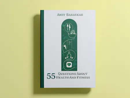
The four pillar icons stacked vertically inside an arched panel, a totem-like structure set against a white field with a botanical icon pattern. Forest green palette with white line-work gives a naturalistic, contemporary wellness feel.
- Forest green
- White field
EXPLORATION 3
The Totem Colour Variant
The same arch structure tested against a warm yellow-green background to evaluate contrast, shelf presence, and warmth. The
muted citrine field softens the green, shifting tone from clinicalto welcoming.
- Forest green
- Warm citrine

EXPLORATION 1 · EARLY CONCEPT
The Sticky Note
An early-stage concept exploring a colloquial register: a yellow sticky note pinned to a solid cobalt blue cover with handwritten title. Friendly, but too casual for the author’s
credentialed positioning.
- Cobalt blue
- Yellow sticky
WHY THE ANNOTATED DIAGRAM WAS SELECTED
The annotation concept won because it reflected Amit Baraskar’s dual identity most precisely. The hand- script labels carry warmth and accessibility, while the clean icon grid and structured typography signal the rigour of a certified expert. The blue-grey palette reads as authoritative without the stiffness of a textbook. The framed panel-within-panel structure creates visual depth without ornament, and the large “55” numeral in the title hierarchy makes the book’s format immediately legible, which is essential for discoverability on platforms like Amazon and Kindle. The totem concepts, while visually striking, pushed the book further into the wellness lifestyle category rather than positioning it as a structured knowledge resource.